Portfolio · websites

Websites that make people book and get in touch

We build websites and landing pages end to end: structure, copy, design, mobile version and launch. Below are pages that are already live. Scroll each one here or open it live.

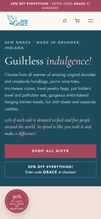
sewgrace.com
sewgrace.com website on a computer
sewgrace.com website on a phone

Scroll the page inside the frame

Shop redesignWooCommerceEnglish

Sew Grace, handmade gifts

Ethel sews kitchen towels, pot holders, wine totes and handbags herself, and every print is one of a kind. We rebuilt her WooCommerce shop as a gift shop where everything is on the first page.

  • Colours from the logo. Teal from the word Grace, the olive branch and rose buttons, while serif type and a handwritten signature suit things sewn by hand.
  • Everything on one page. All 123 gifts in stock right on the home page, in groups with a filter, so nothing has to be hunted for.
  • Her own words. Ethel's own texts on top and the 20% GRACE coupon, visible on every page.
  • The maker's story. A block about Ethel with her signature and the fact that half of every sale goes to missions.
Open live: sewgrace.com ↗
spartajobs.pl
spartajobs.pl website on a computer
spartajobs.pl website on a phone

Scroll the page inside the frame

Recruitment agency websiteWordPress4 languages

Sparta Jobs, recruitment agency in Kraków

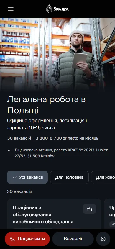
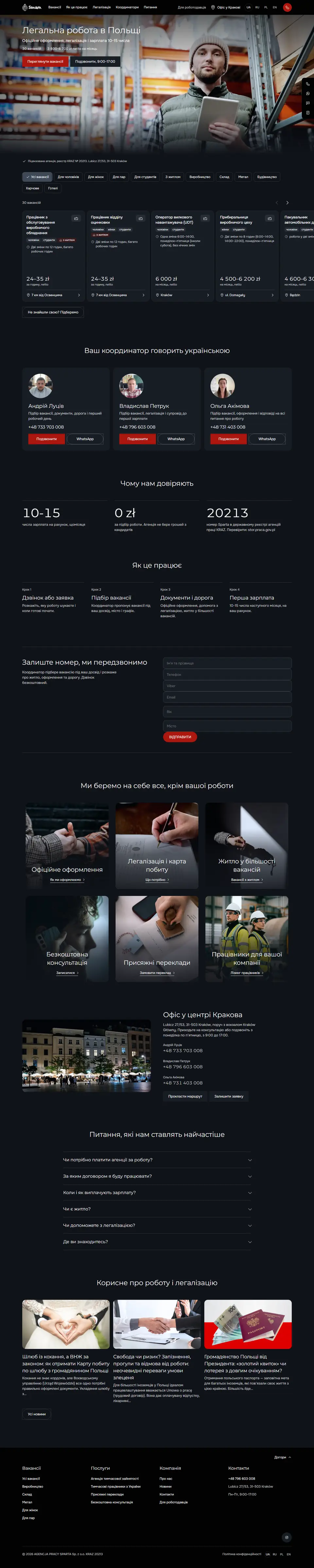
The agency finds jobs in Poland for Ukrainians and other foreigners and supplies workers to Polish companies. We rebuilt the old site from scratch: one path for people looking for work, another for employers, and a job can be found and a call made straight from a phone.

  • Two sites in one. The site for candidates speaks Ukrainian and Russian, the one for companies Polish and English, each with its own menu, forms and phone number. Visitors land on the version in their own language.
  • Jobs with filters. One tap shows work for men, for women, for couples, for students or with housing. Each card has the net rate, the schedule and the city.
  • Real people instead of an anonymous form. Three coordinators with a photo, phone and WhatsApp, under the heading “Your coordinator speaks Ukrainian”.
  • A call from any screen. On a phone a bar with Call, Jobs and WhatsApp is always at the bottom, and outside office hours it offers an application instead of a call.
  • Trust built on facts. The number in the state KRAZ register of agencies with a hint on where to check it, recruitment for 0 zł and pay on the 10th to 15th of the month to a bank account.
Open live: spartajobs.pl ↗
hairallure.pl
hairallure.pl website on a computer
hairallure.pl website on a phone

Scroll the page inside the frame

Salon websiteWordPressPolish

Hair Allure, beauty salon in Kraków

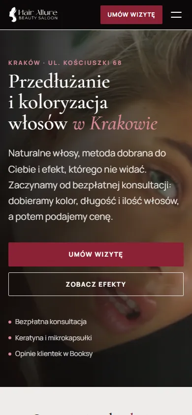
The salon does two things: hair extensions and colouring. The site had to show real results, answer questions before booking and let people book in one tap, on a computer or a phone.

  • Video on the first screen. Hair in motion close up, a headline with the city and the service, and a booking button under it. In a second you know where you are.
  • Booking in the header. The “Umów wizytę” button goes straight to Booksy and stays in view on every screen, with the salon's phone next to it.
  • Real work instead of stock photos. The gallery is made of the salon's own client photos: length, colour, capsules close up, the procedure and the team.
  • Answers before booking. A comparison of methods, the steps of a visit and questions before the first booking. Clients come to the consultation prepared.
Open live: hairallure.pl ↗
edrockets.com
edrockets.com website on a computer
edrockets.com website on a phone

Scroll the page inside the frame

Personal brand landing pageUkrainian

Serhii Rodinov, strategic advisor

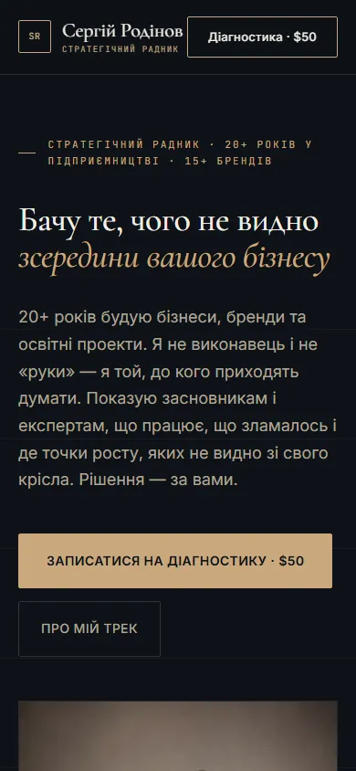
An advisor to founders and experts with over 20 years of experience. The page had to explain how he helps, prove it with numbers and bring the reader to a paid diagnostic session.

  • Positioning from the first line. “I see what can't be seen from inside your business” and a button to book a $50 diagnostic session right below it.
  • The client first, then the advisor. The “If this is about you” block lists the reader's pains, and only after it come the areas of help, the approach and the bio.
  • Proof in numbers. Case studies with the context and result of each project, not a list of big names.
  • Prices in the open. A map of ways to work together shows every format from diagnostics to ongoing support, so the people who book a call already fit both the format and the price.
  • A premium look. A dark background, gold and a classic serif typeface suit an advisor people come to for thinking together, not for a quick tip.
Open live: edrockets.com ↗
mere.black
mere.black website on a computer
mere.black website on a phone

Scroll the page inside the frame

Landing page with a shopWooCommercePolish

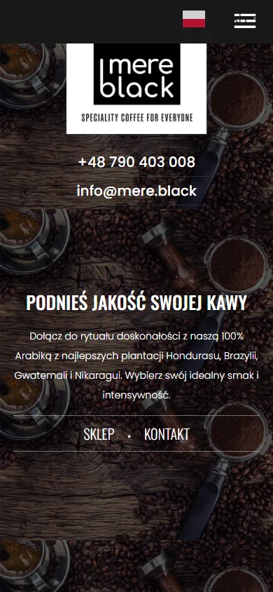
Mere Black Coffee, whole bean coffee

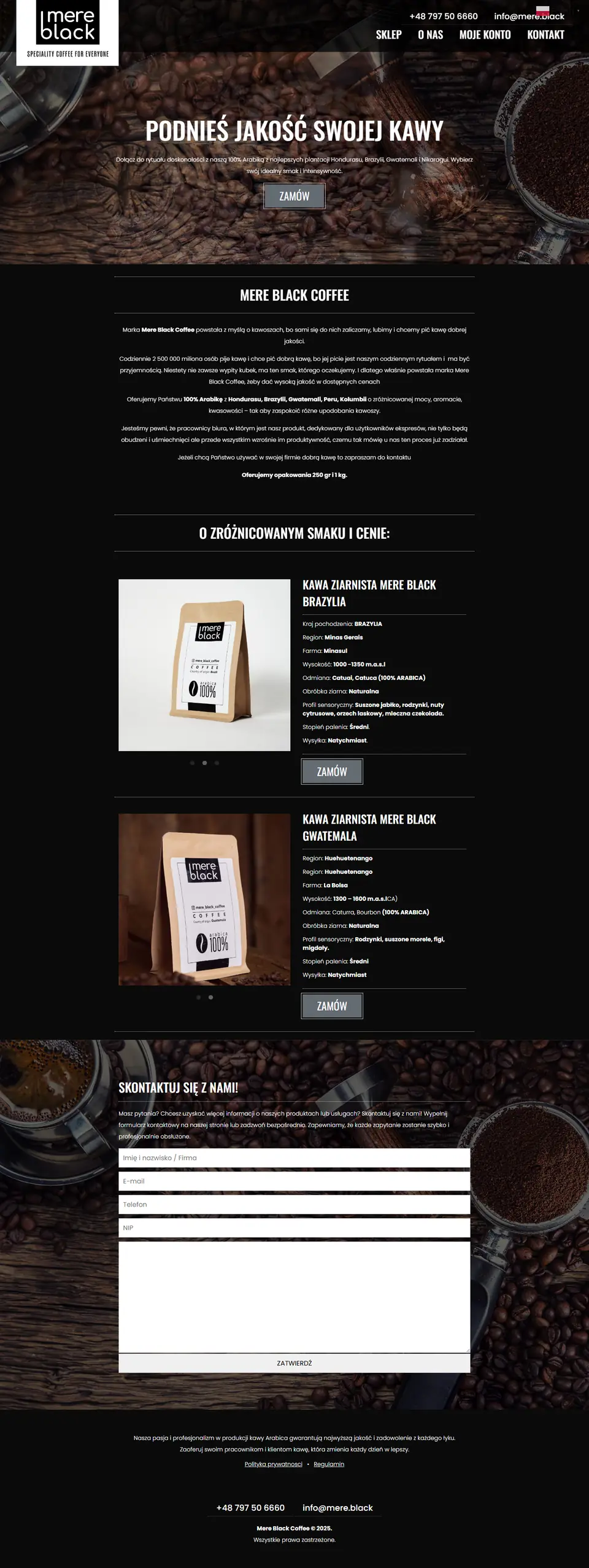
A Polish brand of 100% Arabica for coffee lovers and offices. The landing page had to convey the taste through a screen and let people order a bag without looking for a shop.

  • Atmosphere from the first screen. Coffee beans on dark wood, the call “Podnieś jakość swojej kawy” (raise the quality of your coffee) and an order button right below it.
  • Every coffee has a passport. Country, region, farm, altitude, variety, process, tasting notes and roast level. For a coffee lover these are arguments, not just a name on a bag.
  • Ordering in one tap. A “Zamów” (order) button sits next to every coffee and leads to a WooCommerce shop with online payment.
  • A separate path for companies. A block about coffee for the office and a contact form: a company can arrange regular deliveries instead of buying one bag at a time.
Open live: mere.black ↗
ahg36.com
ahg36.com website on a computer
ahg36.com website on a phone

Scroll the page inside the frame

Gallery website with a shopWooCommerceEnglish and Polish

Gallery 36, painting gallery in Kraków

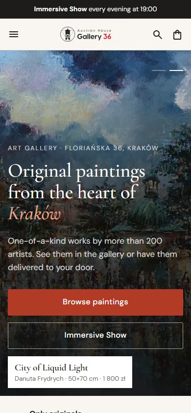
The gallery at Floriańska 36 sells original paintings by more than 200 artists and runs an Immersive Show every evening. The site had to be a shop window where people can choose a painting, try it on their own wall and buy it without leaving home.

  • A first screen like a gallery room. Paintings from the collection change in the background, and a label shows the title, artist, size and price. One button leads to the catalogue, the other to the show.
  • Entry by budget and by subject. Tiles from “under 500 zł” to “over 2 000 zł” and sections by subject: Kraków, nature, animals, people. Visitors go straight to where their painting is.
  • The painting on your wall. The painting page has three tabs: the painting, in a frame and on a wall to scale. Next to it, a frame designer, the gallery in 3D and a 3D animation.
  • A show people buy tickets for. A dark block with photos of the Immersive Show: time, length, number of seats and a button to buy a ticket.
  • A shop without extra steps. Cart, checkout, favourites and a customer account on WooCommerce, the whole site in two languages.
Open live: ahg36.com ↗
fiber.bet
fiber.bet website on a computer
fiber.bet website on a phone

Scroll the page inside the frame

Online shopWooCommercePolish

S.E. TRADE, fibres for concrete

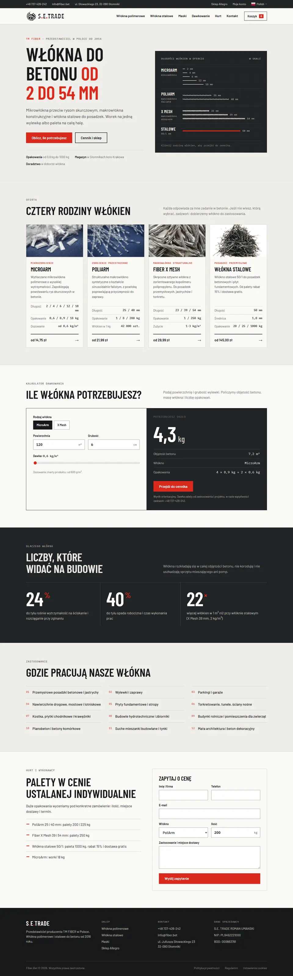
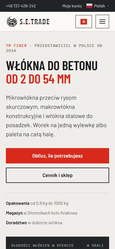
The TM FIBER representative in Poland sells micro, macro and steel fibres for concrete, from a bag for one floor to a pallet for a whole hall. The buyers are builders, and they choose by specs, not by pictures.

  • Fibre lengths to scale. The first screen has a ruler: every fibre family is drawn at its real length, from 2 to 54 mm. A click on a family leads straight to its price list.
  • A shop that works like a price list. Instead of identical product cards, a table by family: length, pack, stock, price and an add to cart button in one row.
  • A dosage calculator. Enter the area and thickness of the screed, and the site works out the kilograms of fibre and the number of packs.
  • A separate path for wholesale. Pallets without a listed price got a “Zapytaj o cenę” (ask for a price) button and a form for quantity, use and delivery place.
Open live: fiber.bet ↗

How we build a website

  1. We work out who your client is.What worries them, what they fear and what they need to see to write to you. The structure of the page grows from that.
  2. We write the copy.Each block answers one question of the client and leads to the next. No filler and no generic words found on every other page online.
  3. We design for the niche.A beauty salon, an advisor and a coffee brand look different, because their clients choose differently.
  4. We check it on a phone.Most visitors come from a smartphone, so we check every screen on a narrow screen, not just on a computer.
  5. We launch and hand over.Domain, hosting, request forms, email. You get a finished website and all the access to it.

In progress

What we are working on now

The site is still being built, but the mockup can already be scrolled. Here are the projects on our desk right now.

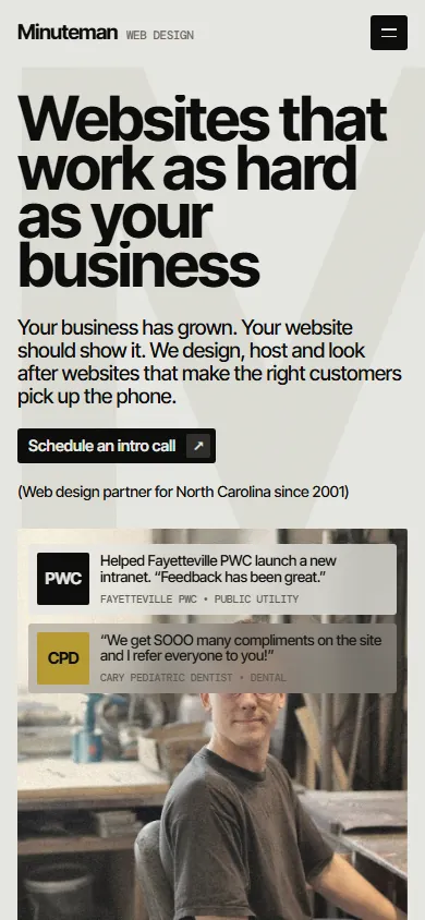
web studio, Fayetteville
web studio, Fayetteville website on a computer
web studio, Fayetteville website on a phone

Scroll the page inside the frame

MockupRedesignWeb studio siteEnglish

A web studio in North Carolina

Since 2001 this Fayetteville studio has built and looked after sites for local businesses, churches and town offices, over 400 today. Its own site dates from 2015, so we are building a new one that looks as good as the sites the studio sells.

  • The work brings the colour. Warm off-white and near-black, big type and almost no colour of its own: the client sites are the bright part.
  • Recent launches in a frame. Five new sites scroll on their own inside a laptop frame, with the phone view next to them.
  • 25 years, year by year. A 2001 to 2026 timeline of the sites that joined the portfolio each year, plus a wall of client logos.
  • Easy to call. The phone number sits in the header, on phones a call button follows the page, and the header shows if the office is open right now.
Open the mockup ↗
rosa.kharkov.ua
rosa.kharkov.ua website on a computer
rosa.kharkov.ua website on a phone

Scroll the page inside the frame

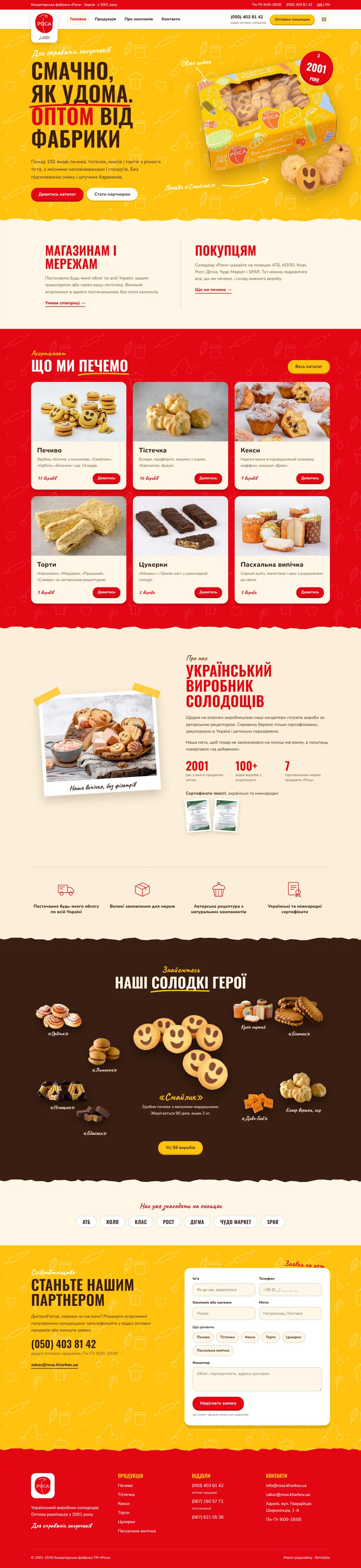
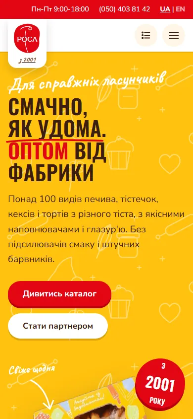
MockupRedesignWholesale catalogueUkrainian

Rosa, a confectionery factory in Kharkiv

Since 2001 Rosa has baked biscuits, pastries, cupcakes and cakes for shops and chains like ATB, KOLO and SPAR. The old site runs on Joomla from 2017; we are building a new one so a wholesale buyer can find a product and send an order from a phone.

  • Style from the box. The yellow background and white drawings come straight from their packaging, and the box of biscuits is on the first screen.
  • Two doors. One way in for shops and chains, one for shoppers, and a wholesale button in the header of every page.
  • A catalogue with facts. 56 products with shelf life, case weight and ingredients, plus search and category filters.
  • An order list. Products go into a list right from the catalogue and land in the wholesale order form.
Open the mockup ↗

Need a website or a landing page?

Tell us what you sell and to whom. We will suggest a structure and tell you what it will cost.